
Horror Business Record Store Day Process
One of the most exciting projects I've had the pleasure to share lately has been my art print included in the great Death Waltz Recording Company's Record Store Day release of Steve Moore's soundtrack for Horror Business, a 2005 documentary on independent horror films.
The project came together fast - and it wasn't easy. How to make a horror doc that not many people had seen seem exciting? Steve's fantastic score speaks for itself (listen/buy it here on bandcamp). It's a brilliant ode to Carpenter and synths of old, with each track creating a new moody soundscape that OST horror fans will flip over.
Spencer at Death Waltz asked if I might want to go crazy with some of the behind-the-scenes footage that made up the doc. Having reenacted silly satanic rituals in a cold garage in the middle of winter for a public access show years ago, I knew firsthand that there's gold in on-set no budget horror productions. Plus the doc had interviews with Joe Bob Briggs - I mean, he had to make the cut, right? (psst, he did!)
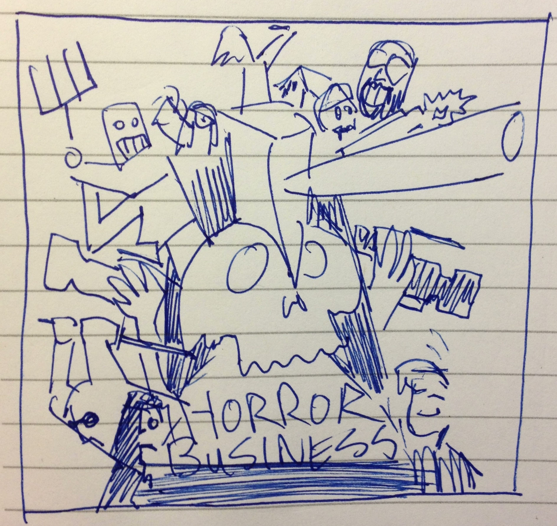
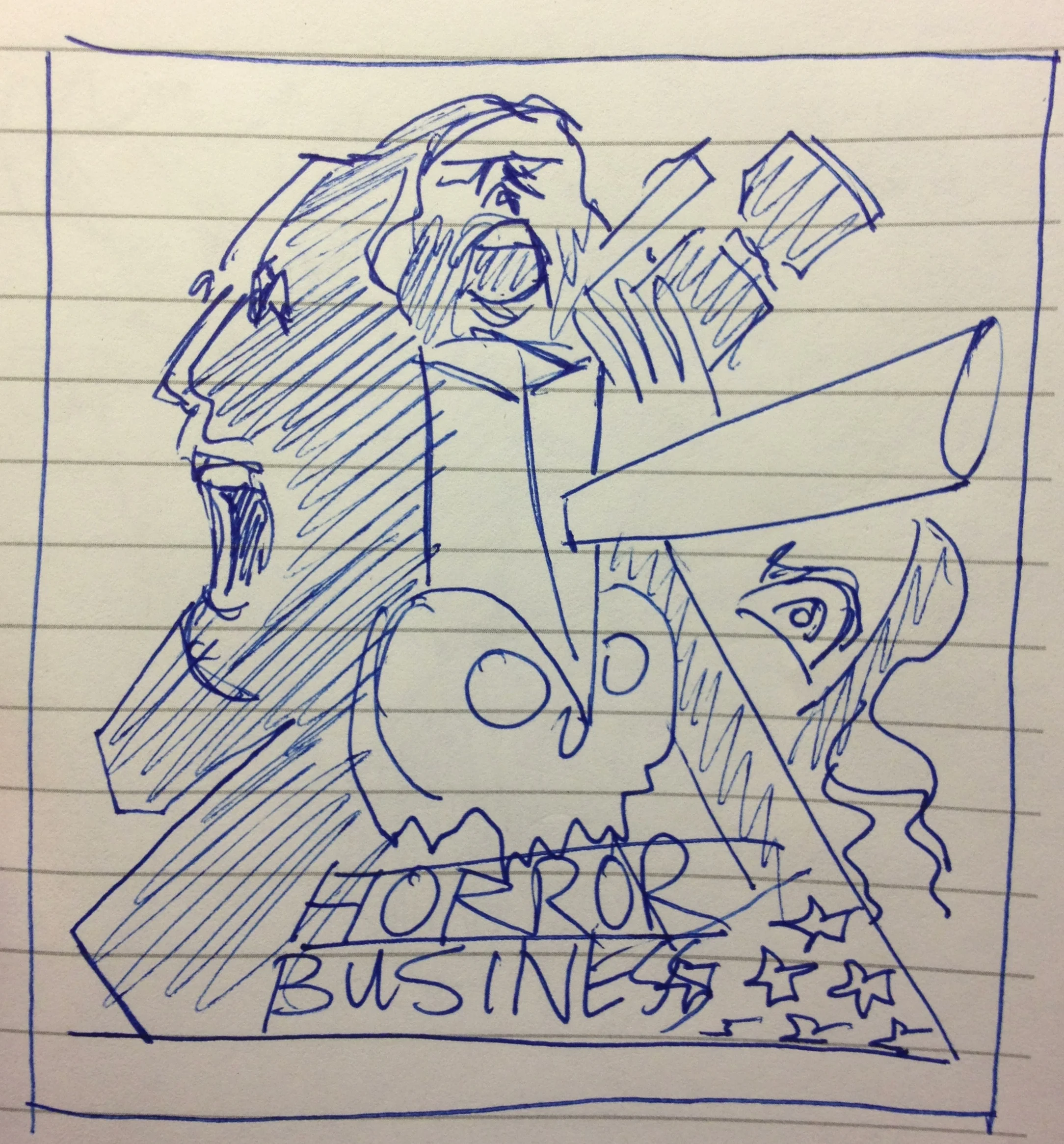
My process started with collecting screencaps from the doc. Many screencaps...
One part of Horror Business that I flipped for was John Goras' animations, the highlight being the axe in the skull (watch his cool animated Ghost Tank short here). That one image became the focus of two of my crude sketches that were culled from my favorite stills, as seen below. 9/11 ended up figuring into three of the four designs since that tragedy is echoed throughout most of the doc.


Now there's a lot of different routes to take from here, but given the time constraints, I figured it'd be best to do some quick Photoshop montages mimicking the sketches.


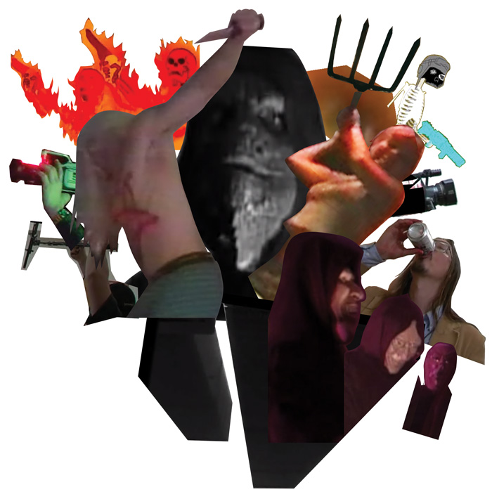

From here, I decided to do some quick mockups in Illustrator before presenting to Death Waltz. It doesn't take too long to block out shadows and highlights, then since some of the elements were reused in different designs, they could be copy and pasted, making it go a lot faster. Text was put in purely as a placeholder since I knew it'd be fleshed out later.
From here, Spencer and I both agreed that the first and last were the strongest (though there are elements from the others that I still dig). After some back and forth, it was decided to go with the first one. From there, much of the work in Illustrator was redone and tightened, though there are carry-overs from the first draft in the final design. Also the flag head was brought in from the third draft since it was such a strong image. Add in some blood splatter and refined lettering and that's it -- a Death Waltz art piece was created!
Be sure and contact your local record store to see if they'll be getting it (US buyers - Death Waltz's distributor is Light in the Attic, FYI). In the meantime, mega thanks to Spencer, everyone for their kind words on the piece, and to Steve for the years of amazing music! Congratulations on having this piece seeing the release it so richly deserves.
-Wheeler